Figma to WordPress Workflow: From Design File to Pixel-Perfect Build
How I move from a Figma design to a WordPress site that matches it, stays responsive and remains editable.
By AbuHasan
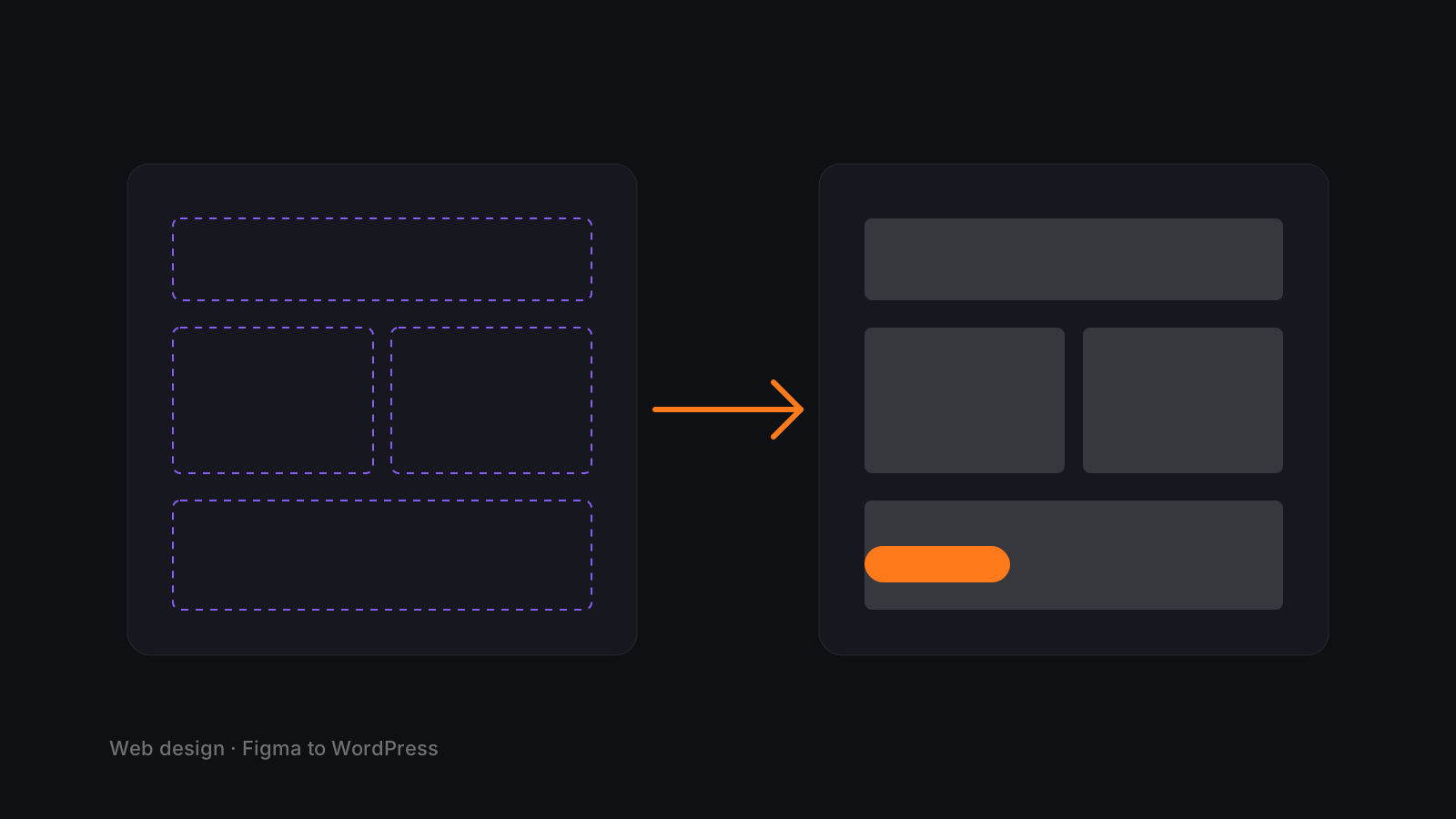
Demo article. Placeholder content to demonstrate the blog system. Replace from the admin.
Pixel-perfect is a process, not a talent. This is the one I use.
1. Audit the file before building
- Confirm breakpoints exist (or agree on them).
- Extract the type scale, spacing scale and color tokens.
- Flag anything that will not translate to the web as drawn.
2. Set up global styles first
In Elementor (or the theme), define global colors, fonts and container widths from the Figma tokens. Every element then inherits correctly, and later changes happen in one place.
3. Build the templates, not the pages
Header, footer, section patterns and reusable blocks come first. Pages are assembled from them. This keeps hundreds of pages consistent.
4. Build desktop, then refine down
Desktop establishes the structure. Tablet and mobile are deliberate redesigns of spacing, order and hierarchy, not shrunken copies.
5. Compare side by side
Overlay screenshots against the design at each breakpoint. Fix spacing and alignment before moving on.
6. Hand off with guardrails
Document which elements are meant to be edited, lock the ones that are not, and record a short walkthrough for the client's team.